Not only did my first child get home from her mission (she was in Hong Kong and Macau, representing The Church of Jesus Christ of Latter-day Saints for almost 19 months away from me) and returned home on Good Friday, April 18, 2014, but like many returned Mormon missionaries, she went and found herself a husband and got married! Ha ha. We are very happy for them, and as you can imagine, my life has been sort of hectic with parties and celebrations, and life. So, I just want to check into my little blog and say hi and that I'm alive! Phew! Another blessing.

She got married in December after finishing a semester back at college at Brigham Young University, and went on a winter honeymoon, then we had a wedding reception for the newlyweds in Texas that was all about lemon yellow and cobalt blue. Every time I see something in these colors to this day, I can't NOT think about the wedding. (That's a double negative, which means a positive! I'll never look at those colors the same. I was reading a Berenstain Bears book to my son today, and noticed the pa and little bear wore yellow and blue. See what I mean?)

We had a buffet dinner with heavy hors d'oeurves and I made desserts, which was fun for me, since I'm a baking enthusiast and always enjoy sharing treats with my friends and family. This past year, I have been on a monster cookie roll, normally putting six M&M's on each one, in coordinated colors. For the reception, I made these baby monster cookies, half the size of the usual, and so cute and yummy. I also made mini pecan pie tarts, and of course we had wedding cake, made by a pro.
The night before the reception, I made a record breaking (for me) amount of heart shaped sugar cookies, just under 200 in about two hours. I was seriously in the zone! I rolled, cut, baked, timed, removed from the oven, every eight minutes, with both ovens, and used up every baking sheet I owned. It was intense! I wanted them to be fresh, and they certainly were. I frosted the cookies with yellow royal icing and they turned out pretty well.
Their wedding announcements were from Wedding Paper Divas and were absolutely beautiful, a very thick, heavy paper, in a tri-fold design, with print on both sides, which came in handy for all the details for the various locations of the actual wedding and two receptions.
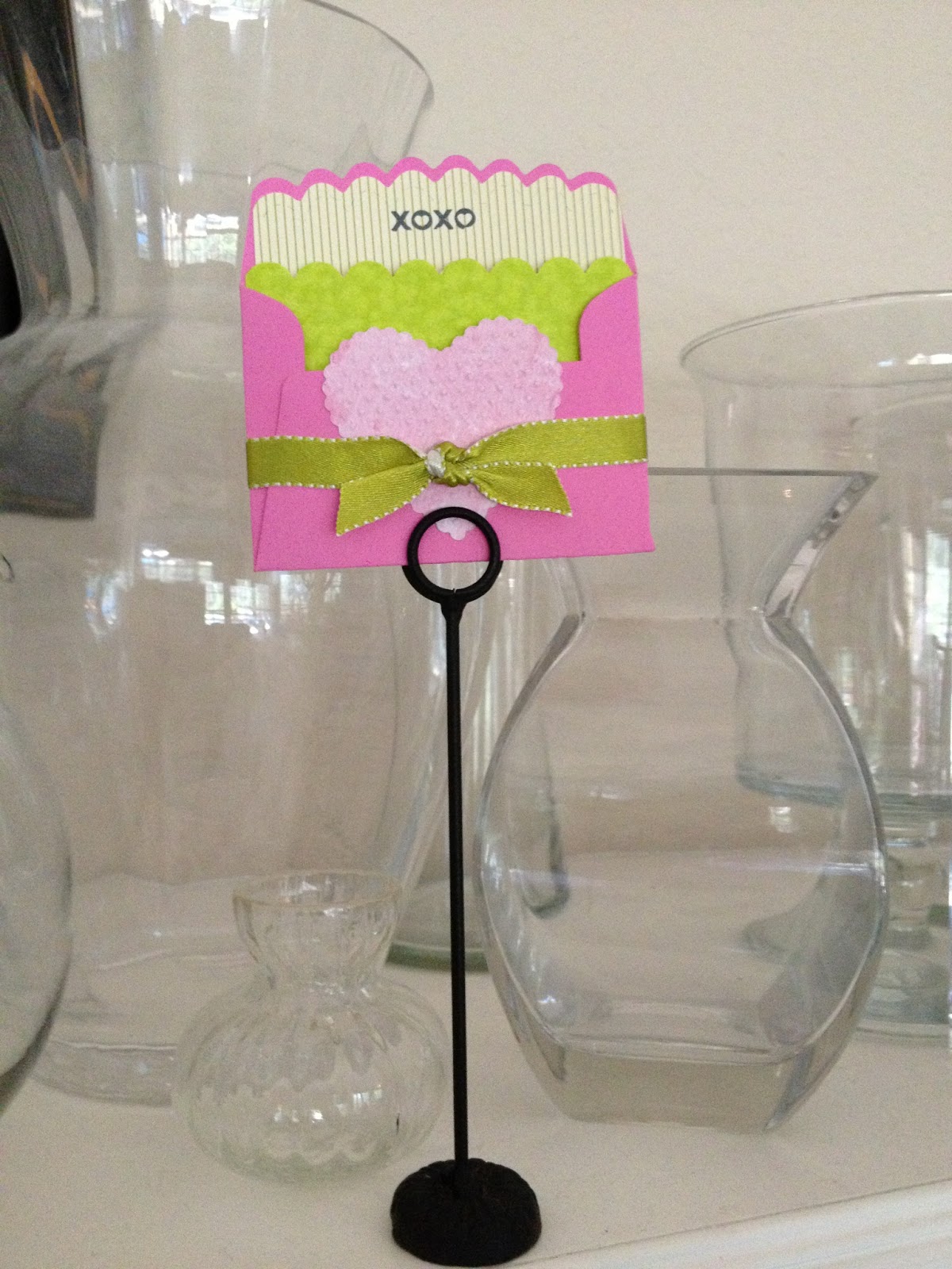
So, as you can see, they lived happily ever after. Well, at least a month or so into their ever-after! I have indeed made various cards since my one and only post of 2014, but have not blogged the excitement. Maybe sometime this year? Who knows. Stay tuned. I still am wild about my little hobby, even though it may not seem like it. Until then, thank you for reading!


.jpg)